“Hold me close, you turn nighttime into day.”
I can’t hear America’s “Today’s the Day” without thinking of two things. And of course, I can’t help but think a few other things about those two things.
One was how I used to take song titles and make little sayings out of them on the backs of my notebook tablets when I was in 5th and 6th grades. I distinctly remember writing “Today’s the Day and Tonight’s the Night” in the lower left corner, encircled by double wide blue ink. Not one of my better ones, but certainly what passed for my wit, and a moderate hit (peaking at number 15 on the elementary top 40) with my friends (I only accidentally alluded to the rod stewart song…..was not a big fan of rod the mod). By the way, yes, my penmanship sucked at that early stage too, although I was careful enough with my sayings so that people would be able to read them. Probably the last time I made an effort with my handwriting (thank goodness for computators, eh?) What I wouldn’t give to have just one of those cardboard tablet backings today. I might have to cast my memory back and see if I can’t catch something else out of that particular lake.
The other particular memory associated with that song is a vision of a 45 (that’s a vinyl single, miss Jackson if you’re nasty). Grey with overplay (no virgin black vinyl sheen there), mis-sleeved (I’m thinking RSO sleeve), clicks and pops abounding when played. The singles back then were almost all courtesy of my older sister, Eve. She was so lucky, she’d get used singles from her friend Glynne Hubbard (and no, I didn’t have to consult the yearbooks for that, btw) whose father owned a vending company that stocked jukeboxes, so when singles cycled out, Glynne would get a pile of 45’s and pass them on to my sis. . I bet I could sit right down and list out about 80% of those singles she had back in the day, so well played and remembered by me. And if you are thinking that’s where my fascination/obsession with the b-sides came from, you would be right. Also, I should be thanking my classmate, Brenda, Glynne’s sister, who provided me with a few stacks by the time we got to 7th grade, when my sis moved well into high school and beyond the pale of pop singles.
However, as much as I loved the catchy melody of “Today’s the Day” (even though America’s songs were usually keyed just a little too high for me to comfortably sing, they wrote the greatest earworms) and endlessly optimistic lyrics, the thing I remember most about that particular single was the lovely California themed label on the 45. Warner Brothers in the mid to late 70’s had this awesome artwork on the interior ring of the 45 (and lps as well although I was still a few years away from long player purchasing); radiantly green palm trees, blue skies and a road that seemingly went on forever that somehow. Talk about branding your product, particularly if your product is southern California rock (Fleetwood Mac pretty much HAD to be on warner brothers now, didn’t they?).

Before I got into albums, 45 label artwork created an amazingly strong visual identity for hundreds and hundreds of the singles of the day that obviously enough still resonates with me. I was all about the music, of course, but there was a healthy does of label artwork that drove my mania as well.
I loved that particular label artwork immensely and have to admit I eagerly sought out the warner brothers 45’s in my sister’s stack just because of the artwork. I know I put “Blinded by the Light” on the console just because of that Warner Brothers label although I immediately realized I knew the song as soon as the needle hit the etching, but would I have flipped the single over and fallen in love with Starbird (and a lifelong love for the Manfred Mann band), if not for that palm tree label? Doubtful.

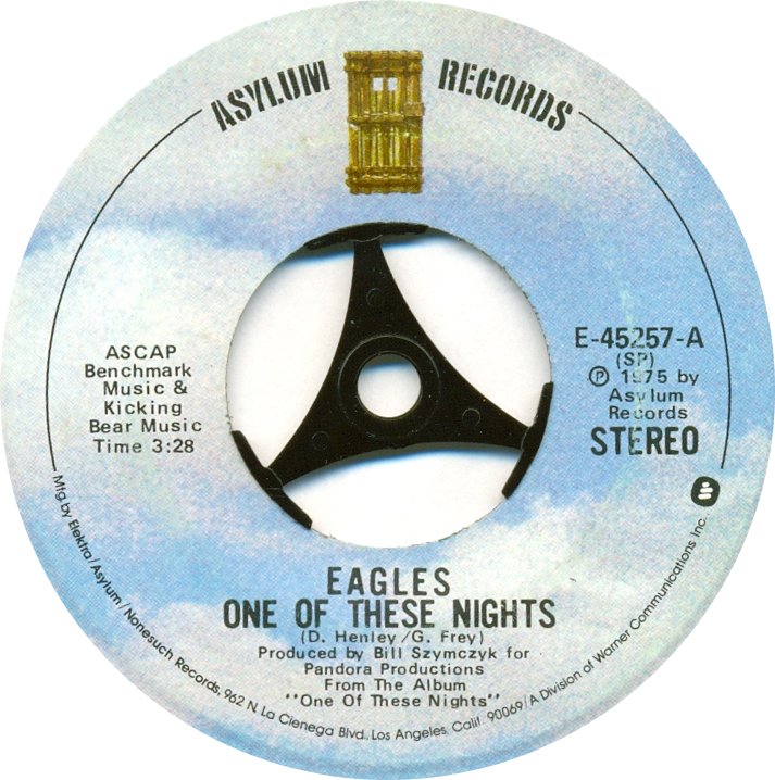
And yes, retroactively, I realize that there’s probably nothing California rock about that progressive rock classic, but somehow it fit my definition of SoCal rock back then as much as the Eagles (Asylum, kinda boring label) ever did…and besides, wasn’t “Hot Summer Night (Planet Records, not bad)” written by Walter Egan (Fleetwood Mac was all over Magnet and Steel, even though the single was on Columbia) and performed by Manfred Mann genius vocalist Chris Thompsons’ band, Night totally southern California rock).
Incidentally, I’m not a fan of the red/orange/yellow Columbia label of the 70’s. Kinda boring label although I think I liked the long player label just a little bit more. Can’t think of that label without thinking of Billy Joel, but I’m not saying anything. Or maybe I am (although of course, I loved those Billy Joel salad days.)

And have no idea what marketing genius changed the label to a bland white background just a couple years later (“we don’t want to be known as the southern California rock label anymore…that has only made us a gazillion dollars. Let’s go generic with our identity completely. And pass me the cocaine please”), but it seems like a huge mistake to me. And it bugs me to no end that I have to remember Rickie Lee Jones’ debut album (yes, I was onto lp’s by then, but I started with the 45 of “Chuck E’s in Love” and I still swoon over “On Saturday Afternoons in 1963.” “The most as you’ll ever know, is back where you used to know”) with that awful bland white label. I’ve mostly gotten over it, and of course, the music never minded at all. BTW, it’s still electrifying to watch Rickie Lee Jones in that video. “If this ain’t healthy, it is some kind of clean”
On Saturday Afternoons in 1963
Chuck E's in Love
The label artwork could be vanity, inspired, and genius. I was always particularly impressed with Elektra. There was the caterpillar; there was the butterfly (or was it a moth). I’m almost afraid to know who got which theme on their single and why. But of course, Queen would be a worm (caterpillar) and bread would be a beautiful butterfly (moth). I don’t want to know if it was random or linear (ok. 1976, we are going with the butterfly (moth) theme this year. In any case, I was delighted when I stumbled upon this little insider joke waiting for me in the stacks of my sister’s 45s.
And I loved, loved, loved the Big Tree label. It was so colorful and busy and full of birds (ok, robins, but still). And of course, I had a sweet spot for England Dan and John Ford Coley. But really, what’s not to like about this? (ok, maybe not the BEST artist to highlight the label)
Of course, the converse of that clever bit of marketing are these tedious labels from RSO (home of the Bee Gees and Geffen) ego much? Also, is that a cow or a pig? And is that a gold medal around the cow/pig (or pig/cow)? What’s up with those horns? And what is the red all about? Losing money? Evil?
RCA (the dog? Really? Well at least they don’t go with the flavor of the weak), Capitol and even A&M labels are similarly boring and corporate. Although at least the A&M label tried a little bit with the lettering graphic.
Arista’s label isn’t any better, but being the idiot of a barry manilow fan that I was, I had to throw it in here. (I definitely liked the darker Arista labels, btw)
Much like Arista, there is nothing particularly interesting about either the Sire or Harvest labels. But the Little River Band was originally on harvest and as infatuated with that band as I was, I couldn’t resist throwing the label up here (much better than when they moved to that boring corporate capitol label). Sire, similarly boring, M logo none withstanding, was a case of one artists (M in this case) leading me to a label that opened a whole wide world of other artists such as Talking Heads, Pretenders, the Cure, the Smiths and Echo and the Bunnymen (just to name a few) who either helped form, or lead me to other acts (such as Kate Bush and REM) that formed the bedrock of my musical aesthetic. As much as America and the Warner Label started this whole process, the Sire label (through M) really caused it to blossom.


It’s been a long time since I noticed label artwork on a new recording. First nail was probably my evolution into album buying. There were so many other bells and whistles to be dazzled by; album artwork, interior sleeves, LYRICS!!!, and detracted from the dominance the label artwork had on those little 45s. I still noticed of course, and I still had a few labels that would turn my head, but by the time I was all about the album, I knew enough to bet on the music and genre’s rather than any loyalty to a label (and I’m not sure where label or record company really differs when you get right down to it). I suppose the advent of the cd ultimately did in the concept of the label for me. All cd’s pretty much looked the same and they were all pretty boring and ultimately forgettable.
Now vinyl is coming back and although I don’t buy vinyl (unless there’s some download code associated with the vinyl buy that will get me downloads to bonus tracks and b-sides) it’s kinda neat to see the retro labels pop up. Clearly Warner Brothers isn’t bringing back that boring white label. It’s palm trees, blue sky and that never ending road. Kinda cool that the record company marketing gurus are finally understanding what they had (long after they lost everything unfortunately). Not that the hubris of record companies is the point of this anyway (well…maybe small point, cos they had it all, pissed it all away, and besides blaming their customers for their downfall, they never really appreciated the art for which they were indirectly responsible.)
Who knows, if this vinyl thing works out (again, it won’t be me, as much as I can appreciate the romance of the brilliant vinyl sheen, I’d take the clarity of a compact disc that plays in my car and never wears out any day) maybe instead of shutting down, maybe a new generation of labels will rise from the ashes. Phoenix records…ya…I like the sound of that.
One last label before i go (another personal favorite):


Oh my gosh, I love this, particularly the cocaine line. And how did I never make the connection between that label and Cali-artists? (And of course we are friends -- we both love us some parentheses.)
ReplyDelete